The Armed forces digital platforms & design system
As Digital design lead at DDB Stockholm
Credits to:
DDB digital
DDB ID
Special credits:
KJ Vogelius
In an evolving world, The Swedish Armed Forces undertook an update to their identity, reflecting a new era shaped by a shifting political landscape, a new generation of recruits, and a stronger sense of unity.
This refresh wasn’t just a makeover; it aligned who we are with where we were headed. We created an identity that was as resilient, inclusive, and forward-focused as our mission. By reimagining our look and voice, we aimed to inspire trust, connect with modern Sweden, and attract the next wave of talent ready to make a difference.
This new identity honoured our past, embraced the present, and looked boldly to the future, ensuring that the Swedish Armed Forces continued to stand for strength, integrity, and a lasting commitment to peace.

Design principles
The Swedish Armed Forces as a Clear Sender
Ensure all design elements unmistakably represent the Swedish Armed Forces, reinforcing their identity and purpose.
Convey Credibility & Dynamism
Balance trustworthiness with a sense of adaptability and energy to reflect the organization’s values and mission.
Intentional DesignExperience design strategy
Every design choice should have a purpose, avoiding unnecessary elements and maintaining a clean, focused approach.
Be Accessible and Easy to Understand
Prioritize simplicity and clarity to ensure the design is inclusive and comprehensible for all audiences.
Styleguide
A complete style-guide packaged the entire digital brand, toolbox, design system with do’s & don't’s for cohesive understanding and implementation of FM’s domains
A flexible toolbox for different use cases and intents
One of our key challenges in developing the identity and toolkit for the Swedish Armed Forces was ensuring scalability across diverse intents and use cases. The system needed to maintain consistency across everything from campaign materials and apps to serving the organization's three primary digital platforms: the recruitment site, the blog portal, and the official government site where certain colours or expressions could be dialed up or down
One toolbox - three different expressions
A complete style-guide packaged the entire digital brand, toolbox, design system with do’s & don't’s for cohesive understanding and implementation of FM’s domains
Signal colours
Signal colours have a heritage in gear such assafety switches & other element that need to stand out
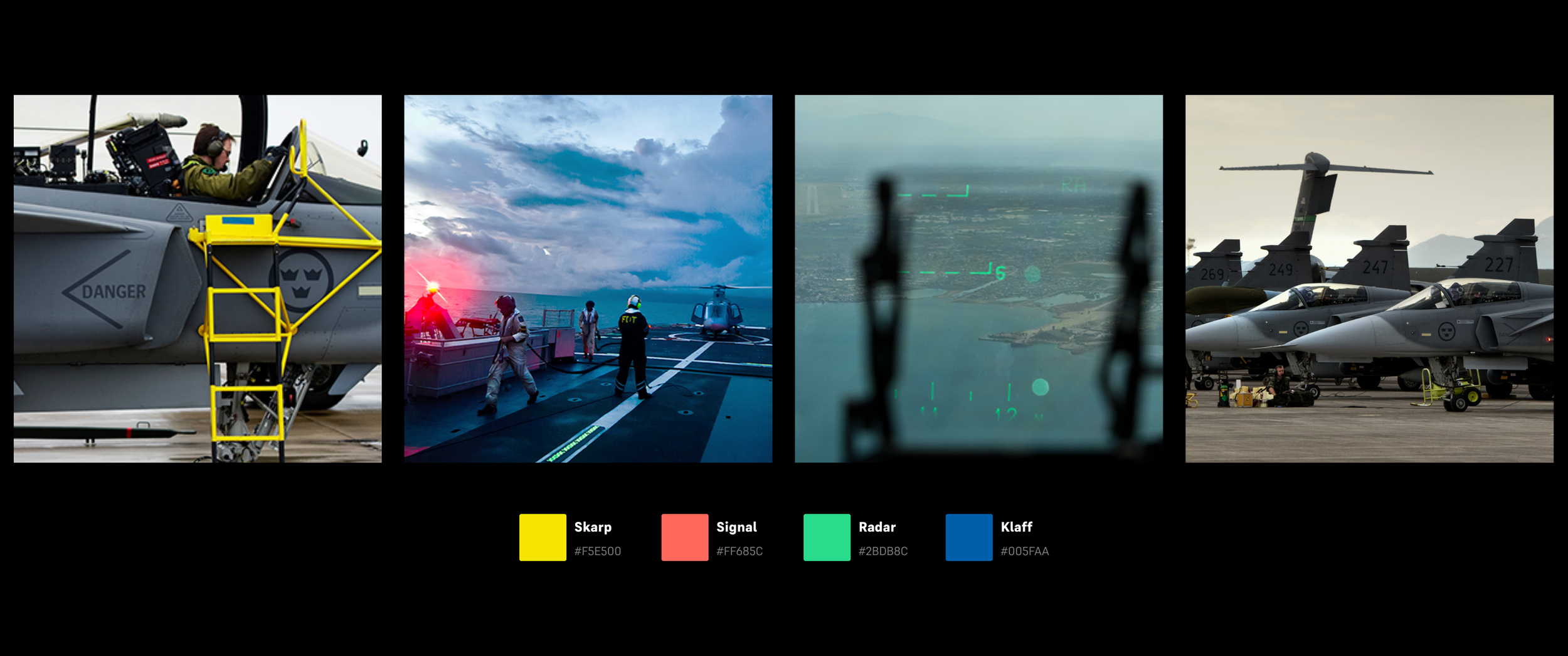
Brand Colours
Primary colours are sprung out of the elements in which they are active.
Typography
When designing the new font for the armed forces, extensive research into archival expressions was conducted to strike the perfect balance between honoring heritage, embracing a forward-looking approach, and optimizing for digital screens.

Site expressions
Some text about where we found inspiration for the identity
Top of Landing page. Recruitment site
Photo heavy with clear areas leading users through the process of applying to the armed forces. Main job of site is to highlight the path into the armed forces and shed light on what its like to servce
Top of Landing page. Recruitment site
Tiled images and less text and entry points to various parts of the site to draw curiosity and clicks
Example of an Inspiration type layout
Tiled images and less text and entry points to various parts of the site to draw curiosity and clicks
Example of an Information style layout
Colours are predominantly gray scale with lots of white for high contrast and focus on readability. Typical for the Government site
Example of an Interaction style layout
A snapshot from the app FMTK (Försvarsmaktens träningsklubb) Armed forces work out club
Example of an Information style layout
A complete style-guide packaged the entire digital brand, toolbox, design system with do’s & don't’s for cohesive understanding and implementation of FM’s domains


