Car mode experiments
Data showed us that the Spotify player view is the most important for drivers in cars and streaming via Bluetooth. The market segment has an addressable audience over 200 MAU, so pushing the needle just a few percent could equal billions of monthly listening hours.
We set out to optimise this view, aiming for an experience easy enough to use while driving, but also providing enough of Spotify Value proposition to avoid churn.
As Design lead at Spotify’s
Cars & Wearables design team
Credits:
Cars & Wearables product area
Note about these concepts
The concepts showcased below were created in pursuit of the optimal market fit for Spotify’s mobile car experience. They emerged as part of my team’s efforts to explore and drive several strategic initiatives within this use case, recognising the significant opportunity it presents.
Main responsabilities
Design Lead
Product strategy
Opportunity assessment
Experience design
Experimentation
Design principles
Low cognitive load
Ensuring interactions are simple and intuitive, minimising decisions & interaction depth.
High glanceability
Making key information easily visible at a glance.
Robustness
Delivering reliable and consistent functionality in diverse driving scenarios.
Graph explaining the relationship between product complexity and usability in the car
Designing for the Car Context: Balancing Safety criteria & Consumption metrics
Overview
Designing products for the car context is uniquely challenging. The graph illustrates a direct correlation between value proposition and UX complexity. The key is striking the right balance—offering a rich, engaging experience that keeps users loyal while avoiding churn. At the same time, over or undercomplicating the interface risks users opting out entirely. Finding this "sweet spot" is especially critical in a setting as high-stakes as driving.
User Behavior
Driver safety adds another layer of complexity. While users may feel comfortable performing intricate tasks—such as texting while driving, despite its dangers—companies like Spotify bear the responsibility of meeting the highest standards of safety. This often conflicts with what users think they want, requiring teams to be creative. How can we deliver maximum value to users, tailored to the driving context, without introducing unnecessary complexity?
For example, a car's interface must be designed to support glanceability and simplicity, ensuring that drivers can absorb critical information in under 1.5 seconds. These constraints force designers to prioritize user safety over feature density—a tough balancing act.
Measuring Success
Securing a product’s place on the roadmap is no small feat. Success metrics for streaming products often revolve around consumption: How long are users listening? Can we increase their engagement? But designing for safety rarely aligns directly with these metrics.
In fact, prioritizing safety can make it even harder to move the needle on consumption. However, it can profoundly impact how users perceive and interact with the product. While data may not explicitly show the ease of switching playlists, saving tracks, or skipping songs, these subtle enhancements often make a tangible difference in users’ everyday lives.
The Challenge
The true challenge arises when a product designed to prioritize driver safety—where interactions are reduced to a glance and tasks are simplified—gets evaluated solely through the lens of consumption metrics. This disconnect between design intent and success criteria underscores the need for more nuanced measurements that account for the context of use.
Car view
First concept launched to users
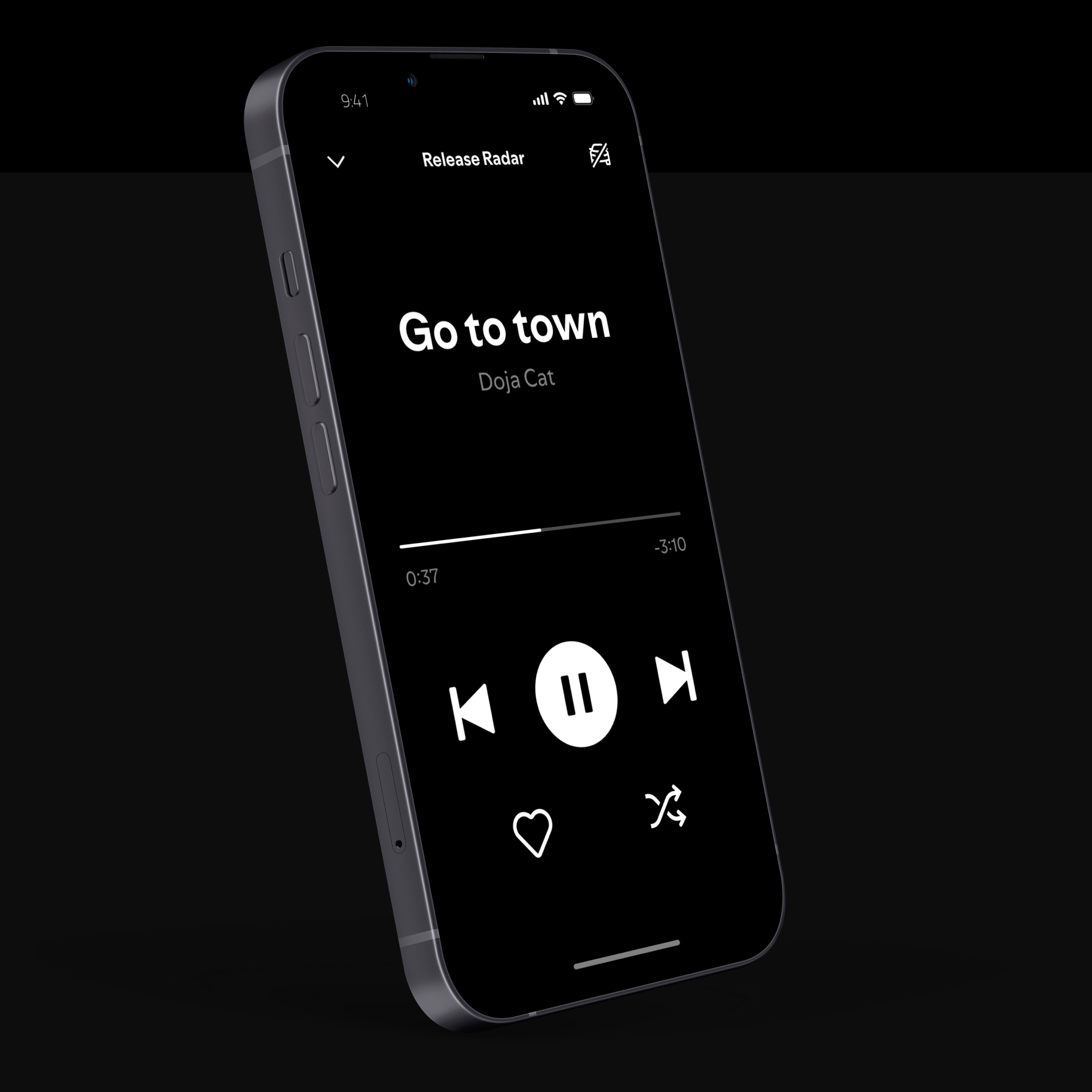
One of the earliest concepts introduced was a highly simplified version of the player view. Any elements that could potentially distract users were stripped away. Even the cover art was removed, as it was believed to draw too much attention from the road.
Version 2
Adding functionality
With the car product established, we focused on gradual improvements and adding value, all while being careful not to increase cognitive load for users. The car space is notoriously sensitive, where mistakes can lead to major PR issues. We took extra care to navigate legal requirements and ensure everything was done correctly.
Improvements
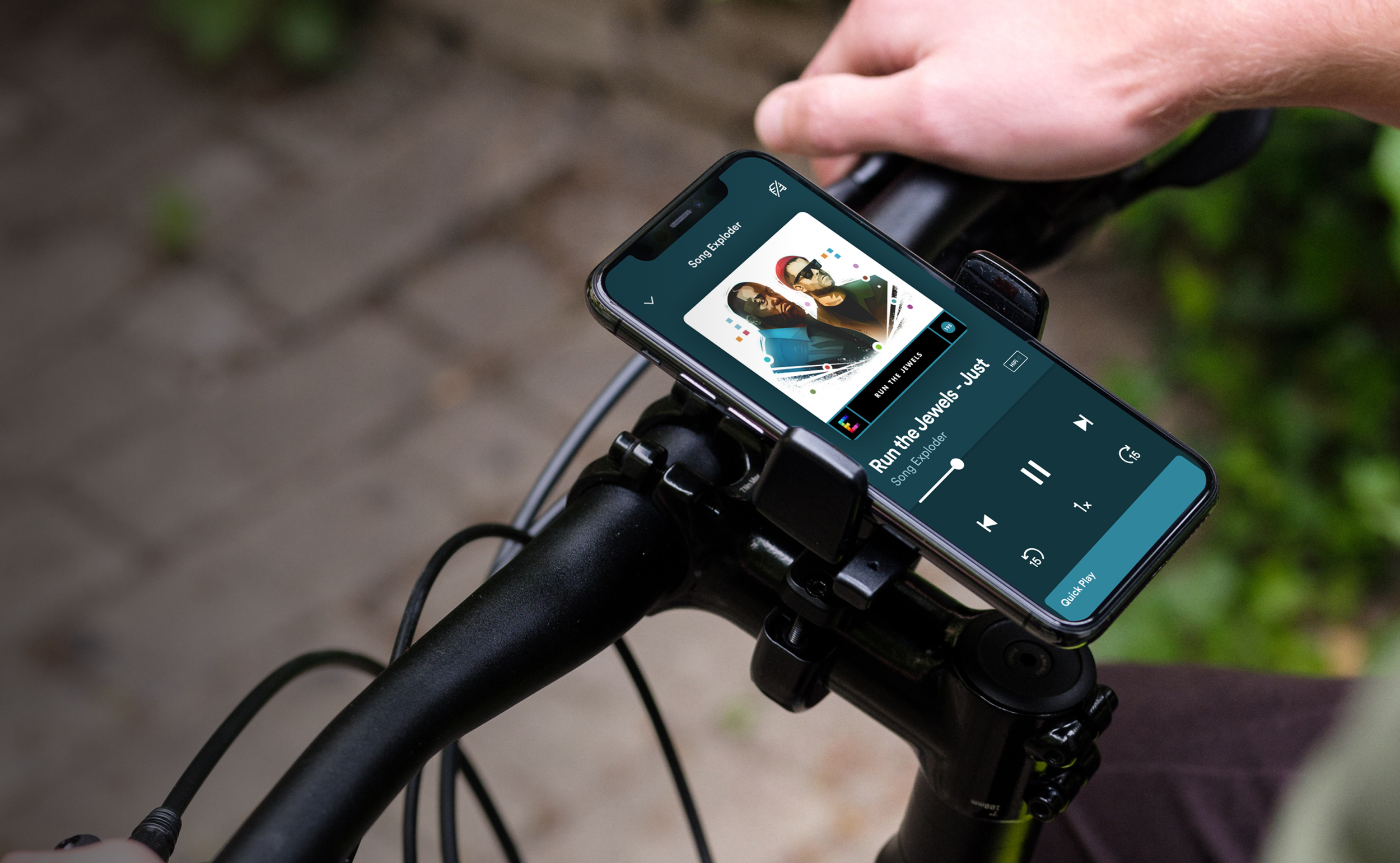
The next generation product included a surface below the controls where users could “quick play” some alternatives from their home screen, displayed in a horizontal list.
The view is now scrollable with familiar contexts from home below the fold for quickly change playlist mid-journey.
Research and testing for safety
When designing for driving and safety, additional frameworks must be considered. Global organizations provide guidelines for OEMs and partners to ensure safe, compliant car experiences.
Spotify’s car experiences adhere to industry standards, including NHTSA guidelines, prioritizing safety for drivers and others.
Key rule: No screen glance should exceed 2 seconds.
Testing usability for driving
Testing usability in a driving simulator with eye tracking allows us to measure safety by analyzing where and how long users focus their attention. This ensures interfaces are intuitive and quick to navigate, minimizing distractions and helping drivers stay focused on the road.
Measuring glance time from the road
Testing usability in a driving simulator with eye tracking allows us to measure safety by analyzing where and how long users focus their attention. This ensures interfaces are intuitive and quick to navigate, minimizing distractions and helping drivers stay focused on the road.


