Re-branding the armed forces
As Digital Design lead at DDB Nord
FM Core team
Credits:
DDB Stockholm
Digital Design
DDB ID
In an evolving world, The Swedish Armed Forces undertook an update to their identity, reflecting a new era shaped by a shifting political landscape, a new generation of recruits, and a stronger sense of unity.
This refresh wasn’t just a makeover; it aligned who we are with where we were headed. We created an identity that was as resilient, inclusive, and forward-focused as our mission. By reimagining our look and voice, we aimed to inspire trust, connect with modern Sweden, and attract the next wave of talent ready to make a difference.
This new identity honoured our past, embraced the present, and looked boldly to the future, ensuring that the Swedish Armed Forces continued to stand for strength, integrity, and a lasting commitment to peace.
Heritage of design language and typography
When designing the new font for the armed forces, extensive research into archival expressions was conducted to strike the perfect balance between honoring heritage, embracing a forward-looking approach, and optimizing for digital screens.


Images & photographic style
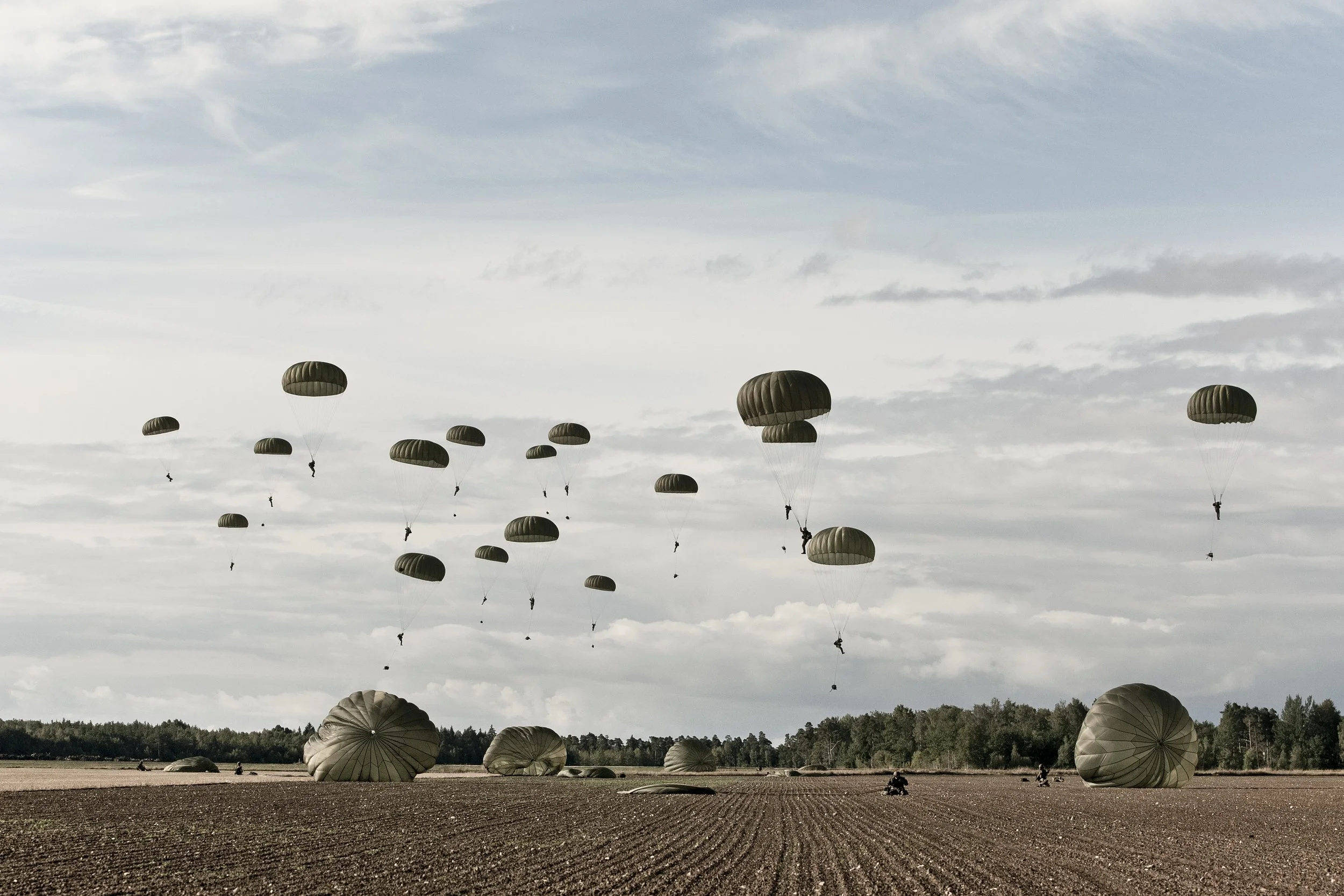
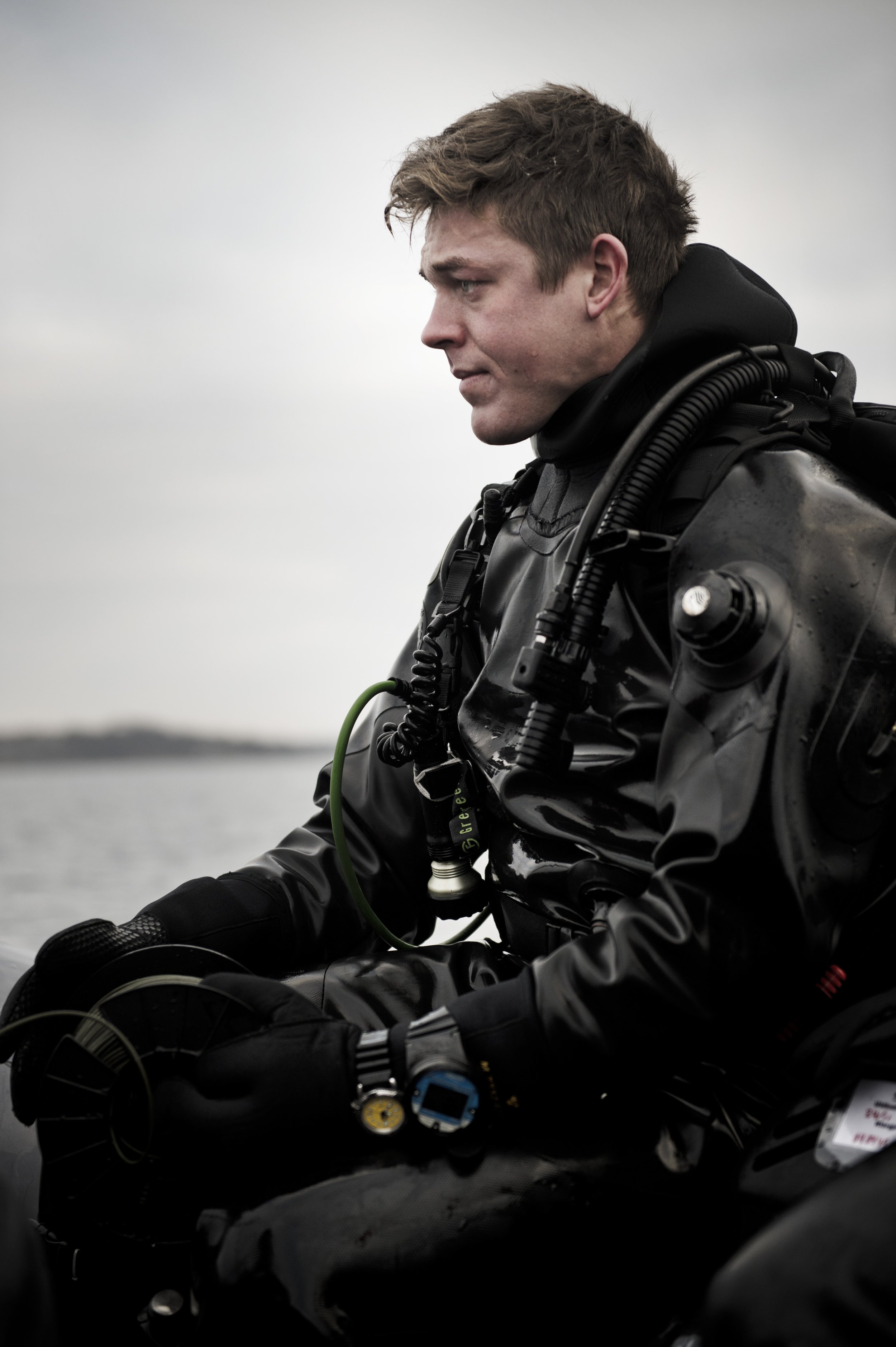
The Swedish Armed Forces' visuals inspire and reflect daily life with warmth, diversity, and openness, drawing viewers into the scene rather than encouraging passive observation.
Portraits spotlight individuals and the collective, emphasizing connection and expression. These staged shots contrast with the spontaneity of action images, ensuring a more engaging and personal focus.
Primary logotype
The three variants of the logotype
As Secondary logotype
Logotype hierarchy.
Typography
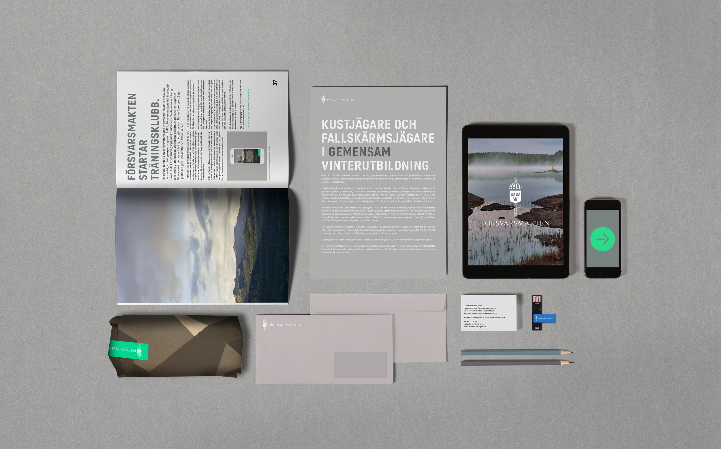
FM Sans is the Swedish Armed Forces' custom typeface, created with Letters From Sweden. Available in five styles, it ensures both variety and consistency across all platforms. Designed for both digital and print use, it adapts seamlessly to any purpose.
FM Sans_Condenced
The Swedish Armed Forces primarily use the custom typeface FM Sans. It is available in both display and text formats. The distinctive stencil version, FM Sans Bold, is ideal for headlines or as a decorative element, ensuring strong recognition.
FM Sans CondencedST_Display font


Colur palette
The Color palette is designed to reflect modernity and clarity, aligning with the tone of our overall visual identity. Moving away from saturated hues like wet moss, we’ve embraced a more subdued, elegant palette reminiscent of mist and dried leaves. To add energy and contrast, accent colors are included for enhanced clarity and dynamism.
Brand Colours
Signal colours have a heritage in gear such as safety switches & other elements that need to stand out
Brand Colours
Primary colours are sprung out fo the elements in which The Armed Forces are active. Forest, Sea, Earth & Ash
M 90 Pattern
The pattern can be applied to any of the brand colors and used as backgrounds to reinforce brand identity and enhance recognition.

Iconography
The iconography is inspired by the stencil typeface without being too decorative. FM Sans Condensed ST can also be used as a graphic element


